


October 01, 2008
My comment:
1) The front cover is put together by the editorial dept and by art. It often involves a completely separate shoot from anything else done for the magazine. Unlike other edit content and artwork, it also has to be seen and signed-off on by the publisher, the circulation manager, and usually several other people. It CAN'T be swapped out at the last minute.
2) The back cover is sold as a back cover--the three most prestigious, non-negotiable positions being a) inside the front cover, b) back cover, c) inside the back cover (also "opposite TOC," "first seven pages," "right page, full edit," etc.--I could go on and on . . .).
3) As magazines are being compiled they are usually laid out on a wall--sometimes two walls (one for editorial, one for advertising). Whoever is doing the final check to make sure that there's no conflict between editorial and advertising is looking for:
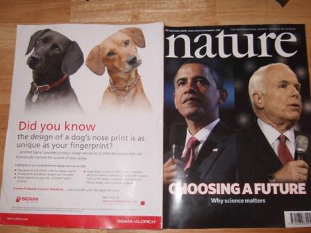
Had the cover image been one of Condi and Bush, I might have done something about it, since there's a particularly nasty connotation about calling a woman a dog. (Same thing if one of the politicians were from the Middle East.) But as it is, it's just a cute juxtaposition that one has to do something completely unnatural to even see--lay C1 and C4 against each other, which only Martians do. And any equivalence between the cute puppies and the not-as-cute politicians is bipartisan. It's fine.
But moving that ad--promised on C4--means getting that advertiser's permission, as well as the permission of the advertiser on C2 (the only other equivalent position) to swap them, and than making sure that this action didn't create much worse problems for the non-Martians who read magazines in a normal way.
You do that without the permission of the editor, the publisher, and the account reps for both of those advertisers, and you get fired. Which means you have to wake them all up at midnight, and they have to call the clients at midnight.
The cover is FINE. It's cute, but you have to do the Martian thing to even know it's there.
Posted by: Attila Girl at
10:03 AM
| No Comments
| Add Comment
- Any ads across from editorial that look too similar (and, no: no sane person worries what C1 and C4 look like together, because THAT'S NOT HOW PEOPLE READ MAGAZINES!).
- Ads with similar content that look like they might be promoting products in the editorial opposite them.
- "Competitive Separation"--IF TWO SIMILAR PRODUCTS HAVE ADS PLACED TOO CLOSE TOGETHER--LESS THAN 5-8 PAGES, SAY--YOU LOSE YOUR JOB.
- Use of bright colors that will "bleed" on a web press, based on the imposition used, and mess up the look of pages that aren't near them chronologically, but will be next to them on the web press.
Post contains 494 words, total size 3 kb.
205 queries taking 0.2902 seconds, 413 records returned.
Powered by Minx 1.1.6c-pink.

